Free shipping across the GTA for orders over $150!

Your cart is currently empty
Product image slideshow Items
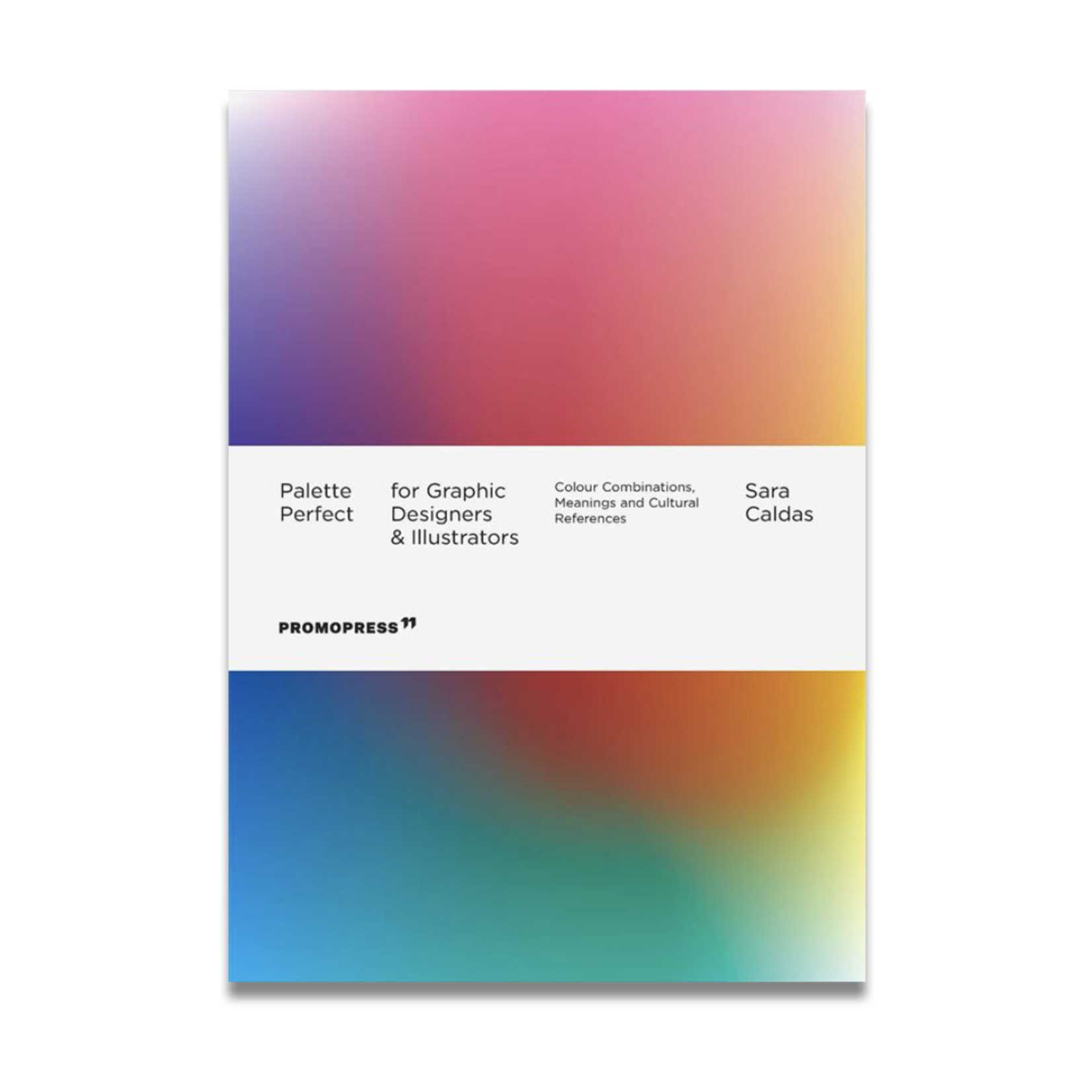
Both a practical and inspirational book filled with colour combinations for any design and illustration project.
The use of colour and its combinations creatively in illustration, graphic and product design also implies understanding what emotions they convey and how they affect our design and illustrations. We must also consider that colour is also perceived differently in different countries and cultures. All this is widely explained in this second book in the Palette Perfect series, illustrated with projects by renowned international illustrators and designers, and organized by colours (identified with CMYK, RGB and HEX codes) and moods associated with the time of day. Diverging from the traditional segmentation of the colour wheel, the book is divided into 24 chapters, each one being an hour of the day. This separation is represented visually by assigning a colour to each hour, based on the usual daylight, temperature, mood and activities of that time, in the temperate climate zone. For example, the first chapters are the first hours of the morning, where the sky and the overall light is present but less intense. Around 1 pm the temperature is usually hotter, therefore represented with warmer colours (yellow and red); after midnight, the focus is put on activities that could be done at that time, like the neon lights of nightclubs. Based on real examples drawn from graphic, product and illustration, different innovative combinations and palettes are shown for each colour and the meaning it conveys. Intended for graphic designers, design students, fashion and interior decoration lovers, and all those interested in exciting and unexpected colour combinations that work.
Author: Sara Caldas
Publisher: Hoaki Books
ISBN: 9788417412944